It seems every blog I post is pouring forth information from some random idea in my head. Well, that is entirely the case, but I wanted to explain myself more clearly for once. Mentioning time and time again that the reasons for these snippets of seemingly useless blog subjects are for research, I have began to cover two specific stories.
One is a fantasy story, modern day, mostly focusing on psychological perspective. This is the reason for the topic on DID, the main character has something very similar to this disorder. At first, being fantasy, there was no real basis of comparison since I was as free as a bird when it came to creating the world they lived in… Then, the more I thought about it, the story takes place modern-day, in a situation people around my age are quite used to. With all of this realism, I wanted the psychological aspect to fit with this believable realm.
The other, unfinished topic is all about art styles, graphic novels, and general shenanigans involving this story though line art that I am in the process of creating. It is a collaboration of sorts… Several friends of mine and I, con goers as we are, decided that we wanted something unique to cosplay for. In case you are in the dark, cosplaying is the fun activity of dressing like someone from one of your favorite shows, games, movies, etc. Anyway, back to the main point, with fun outfits, a sense of humor and a bit of a sugar-high, the idea for Sugar Charm was born.
This is set up to be a parody of sorts, purposely as stereotypical shojo manga as we could possibly make it. The problem was, after working out the details, we all sort of got attached to the idea. This brings us to the present, where I am now elbow-deep in the beginnings of a hilariously awkward attempt at a graphic novel. I seriously do need to get around to posting some pictures of the progress…eventually.
With a plan for the reoccurring art theme to cover everything I need for this recent project, and other more minor topics for the story involving split personalities, I will be kept very occupied by these two themes with these entries. Also in upcoming topics are some oceanic details for a sci-fi I’m working on, a study of reptiles for yet another sci-fi and also a theme very close to my heart. Several posts will be about the Romani, and I’m so excited about it.
Alright, enough with the explanations! I had a dilemma today. In the story I’ve discussed, the one with the character that has split personalities, I realized I was about to write a scene I have no idea about. Ok, picture it, a girl with no brothers, raised by her mother, and a limited number of male friends…shopping for clothes for a guy. This is easy enough to write around specifics, but it occurred to me that outside my range of American, women’s clothing sizes, I had no idea how the rest of the world worked (fashion-wise).
We all know our individual sizes (hopefully), but never personally having experience with sizes in a different system or designed for a different sex from my own, this was a fascinating little system. Using this site called americanappearal.net, it show the basic shirt sizes for men and women. The main comparison being males tend to be larger than females in stature.
Some things I didn’t know though for instance were things such as the conversion from women’s to men’s sizes. If you subtract 1½ from a woman’s shoe size that is the number they would be if looking for in guys shoes. When it comes to pant however, girls need to add the number 21 to their size and viola. Shirts, girls go down a size. Now that I totally get the comparison, this scene to write will be much funnier. Trust me; just looking us so much comparison between the two sides of clothing has been awkward enough.
I have in fact learned something from the making of this blog and even if you didn’t, I will try harder with the coming posts!
Next up: Romani and Gypsies. Who is what, which is where and why is it all so messed up!
Showing posts with label drawing. Show all posts
Showing posts with label drawing. Show all posts
Sunday, May 2, 2010

Friday, April 23, 2010
How to draw (sort of).
Disclaimer: This is a mildly biased piece. Beauty is in the eye of the beholder. No offense is intended by observations/comments that occur within this article.
Ok, niceties aside, there are many different art forms. I’ll be focusing on one for the sake of my sanity. The style for today: Graphic novels. I’m using this style because of its survival being placed solely on line work. You know about Superman, Spiderman, all those with muscles on their muscles and heroic attitudes… Marvel, DC, etc. That would be the American example. For the other end, there are Japanese comics, or manga that I personally tend to read more frequently. Just got into an interesting series called Blade of the Immortal. Love it!

Either way it all starts with basic forms. The first lesson I would like to point out in this style is that PEOPLE TYPICALLY HAVE BONES! I have no idea how people can go on, drawing figures that resemble blobs of moosh with randomly placed muscle structure and mismatched limbs…this is alright… if you happen to be in kindergarten.
Also for the sake of whatever sanity I have remaining, I will not post examples of ‘bad’ art…you can find that on the internet just fine (try looking for something called an ‘oc’) … (in case you’re thinking the show, that is not what I mean). Now, when drawing for graphic novels, the artist or mangaka does not take the time to draw in each system that builds the human figure. Low and behold! There are short cuts!

I cannot stress enough how much I think people should take advantage of basic shapes. Circles, squares, triangles and lines are good friends for those wishing for a proportional figure. You can draw anything by breaking it down into simple shapes first (unless you’re a genius that happens to be perfect…then I have no idea why you’re reading this).

So, now that I’ve stressed the form issue, time to move on to the next step. To make this easier on everyone, the rest will be broken down into a simple guideline.
Step 1: Pick up a pencil. Grab an eraser too while you’re at it. Paper would be a good idea as well.
Step 2: Do some research. Get ideas. This step is to better know your aesthetics and to better understand what the hell you have gotten yourself into.
Step 3: Doodle. This will be a step you go back to forever. It is easy, pressure free and fun. The margins of notes in class can be brilliant practice space.
Step 4: See the pictures accompanying this piece so far? Try something similar. Basic shapes to build a form you want. It’s not difficult I promise. If problems persist, look up more tutorials/buy art books.
Step 5: Draw your little heart out.
Step 6: Get a new sheet of paper, rinse, and repeat as desired.
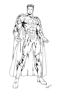
I’m not asking for a lot. I would just like for people to look in a mirror, at pictures, at other people. When you glance from your drawing to a real person, does it seem you’ve drawn an alien reject from a cartoon? If so, it isn’t because you suck. At least I don’t think so… I just believe the lack of observation and thought can lead to ‘epic fail’ in the world of art. I mean, check this guy out. Not realistic per se… but a symmetrical body and proportionally correct for that style… That’s my point boys and girls.
The pictures were from deviantart.com and an art book by Christopher Hart by the way. Tip of the day: Give credit to the artists. They deserve it.
Ok, niceties aside, there are many different art forms. I’ll be focusing on one for the sake of my sanity. The style for today: Graphic novels. I’m using this style because of its survival being placed solely on line work. You know about Superman, Spiderman, all those with muscles on their muscles and heroic attitudes… Marvel, DC, etc. That would be the American example. For the other end, there are Japanese comics, or manga that I personally tend to read more frequently. Just got into an interesting series called Blade of the Immortal. Love it!

Either way it all starts with basic forms. The first lesson I would like to point out in this style is that PEOPLE TYPICALLY HAVE BONES! I have no idea how people can go on, drawing figures that resemble blobs of moosh with randomly placed muscle structure and mismatched limbs…this is alright… if you happen to be in kindergarten.
Also for the sake of whatever sanity I have remaining, I will not post examples of ‘bad’ art…you can find that on the internet just fine (try looking for something called an ‘oc’) … (in case you’re thinking the show, that is not what I mean). Now, when drawing for graphic novels, the artist or mangaka does not take the time to draw in each system that builds the human figure. Low and behold! There are short cuts!

I cannot stress enough how much I think people should take advantage of basic shapes. Circles, squares, triangles and lines are good friends for those wishing for a proportional figure. You can draw anything by breaking it down into simple shapes first (unless you’re a genius that happens to be perfect…then I have no idea why you’re reading this).

So, now that I’ve stressed the form issue, time to move on to the next step. To make this easier on everyone, the rest will be broken down into a simple guideline.
Step 1: Pick up a pencil. Grab an eraser too while you’re at it. Paper would be a good idea as well.
Step 2: Do some research. Get ideas. This step is to better know your aesthetics and to better understand what the hell you have gotten yourself into.
Step 3: Doodle. This will be a step you go back to forever. It is easy, pressure free and fun. The margins of notes in class can be brilliant practice space.
Step 4: See the pictures accompanying this piece so far? Try something similar. Basic shapes to build a form you want. It’s not difficult I promise. If problems persist, look up more tutorials/buy art books.
Step 5: Draw your little heart out.
Step 6: Get a new sheet of paper, rinse, and repeat as desired.

I’m not asking for a lot. I would just like for people to look in a mirror, at pictures, at other people. When you glance from your drawing to a real person, does it seem you’ve drawn an alien reject from a cartoon? If so, it isn’t because you suck. At least I don’t think so… I just believe the lack of observation and thought can lead to ‘epic fail’ in the world of art. I mean, check this guy out. Not realistic per se… but a symmetrical body and proportionally correct for that style… That’s my point boys and girls.
The pictures were from deviantart.com and an art book by Christopher Hart by the way. Tip of the day: Give credit to the artists. They deserve it.
Subscribe to:
Posts (Atom)