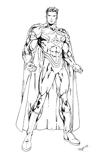
Ok, niceties aside, there are many different art forms. I’ll be focusing on one for the sake of my sanity. The style for today: Graphic novels. I’m using this style because of its survival being placed solely on line work. You know about Superman, Spiderman, all those with muscles on their muscles and heroic attitudes… Marvel, DC, etc. That would be the American example. For the other end, there are Japanese comics, or manga that I personally tend to read more frequently. Just got into an interesting series called Blade of the Immortal. Love it!

Either way it all starts with basic forms. The first lesson I would like to point out in this style is that PEOPLE TYPICALLY HAVE BONES! I have no idea how people can go on, drawing figures that resemble blobs of moosh with randomly placed muscle structure and mismatched limbs…this is alright… if you happen to be in kindergarten.
Also for the sake of whatever sanity I have remaining, I will not post examples of ‘bad’ art…you can find that on the internet just fine (try looking for something called an ‘oc’) … (in case you’re thinking the show, that is not what I mean). Now, when drawing for graphic novels, the artist or mangaka does not take the time to draw in each system that builds the human figure. Low and behold! There are short cuts!

I cannot stress enough how much I think people should take advantage of basic shapes. Circles, squares, triangles and lines are good friends for those wishing for a proportional figure. You can draw anything by breaking it down into simple shapes first (unless you’re a genius that happens to be perfect…then I have no idea why you’re reading this).

So, now that I’ve stressed the form issue, time to move on to the next step. To make this easier on everyone, the rest will be broken down into a simple guideline.
Step 1: Pick up a pencil. Grab an eraser too while you’re at it. Paper would be a good idea as well.
Step 2: Do some research. Get ideas. This step is to better know your aesthetics and to better understand what the hell you have gotten yourself into.
Step 3: Doodle. This will be a step you go back to forever. It is easy, pressure free and fun. The margins of notes in class can be brilliant practice space.
Step 4: See the pictures accompanying this piece so far? Try something similar. Basic shapes to build a form you want. It’s not difficult I promise. If problems persist, look up more tutorials/buy art books.
Step 5: Draw your little heart out.
Step 6: Get a new sheet of paper, rinse, and repeat as desired.

I’m not asking for a lot. I would just like for people to look in a mirror, at pictures, at other people. When you glance from your drawing to a real person, does it seem you’ve drawn an alien reject from a cartoon? If so, it isn’t because you suck. At least I don’t think so… I just believe the lack of observation and thought can lead to ‘epic fail’ in the world of art. I mean, check this guy out. Not realistic per se… but a symmetrical body and proportionally correct for that style… That’s my point boys and girls.
The pictures were from deviantart.com and an art book by Christopher Hart by the way. Tip of the day: Give credit to the artists. They deserve it.
No comments:
Post a Comment